ONIs latest White Paper – Fast, high-throughput LNP sizing and characterization using an automated high-precision workflow read here>
EVP2 Axis 2.0
Last updated: January 12th 2026

Free and open-source analysis tool for easy analysis for extracellular vesicles (EVs) data across multiple datasets.
Instructions
Print Section
Overview
EVP2 Axis is a free and open-source analysis tool for easy analysis of extracellular vesicles (EVs) data across multiple datasets. EVP2 Axis allows users to generate both standardized and custom plots with user-defined sample names, and the analysis of features such as EV counts, size, and positivity plots across several fields of view (FOVs) and samples.
EVP2 Axis is designed for use with datasets acquired using ONI’s NimOS or AutoEV software and analyzed with the EV Profiler or AI EV Profiler analysis tools on ONI’s cloud-based analysis platform, CODI. If using an ONI Application KitTM: EV Profiler 2 for sample preparation, we recommend naming channels listed on Table 1 (note: replace “Custom Protein” with your name of choice).
Table 1
| Base Kit | Imaged With | Channel 0 | Channel 1 | Channel 2 |
|---|---|---|---|---|
| Tetraspanin Profiling | NimOS | CD63 | CD81 | CD9 |
| Tetraspanin Profiling | AutoEV | CD81 | CD63 | CD9 |
| Pan-EV and Tetraspanin Trio | NimOS | Tet Trio | Pan-EV | |
| Pan-EV and Tetraspanin Trio | AutoEV | Tet Trio | Pan-EV | |
| Pan-EV, Tetraspanin Trio, and Custom Protein | NimOS | Tet Trio | Custom Protein | Pan-EV |
| Pan-EV, Tetraspanin Trio, and Custom Protein | AutoEV | Custom Protein | Tet Trio | Pan-EV |
Download Results from CODI
To use EVP2 Axis, data must be downloaded from CODI using the batch download feature. To begin, select the collaboration of choice in CODI and click the “Analysis results” button on the left side (Figure 1). EV Profiling analysis runs automatically with AutoEV, resulting in a populated list of analyses in the results section.
Then, on the upper section, click “batch download” (Figure 2):
- Scroll to datasets of choice and click the empty circles to fill them in (Figure 3).
- Change the name in the upper section (Figure 4, yellow box), then click “download X results” (Figure 4, pink box). A zip file will be downloaded automatically. It is important not to navigate away.
- Open the zip file, which contains four files, and save them. The file needed for EVP2 Axis ends in “results_batch.csv”.
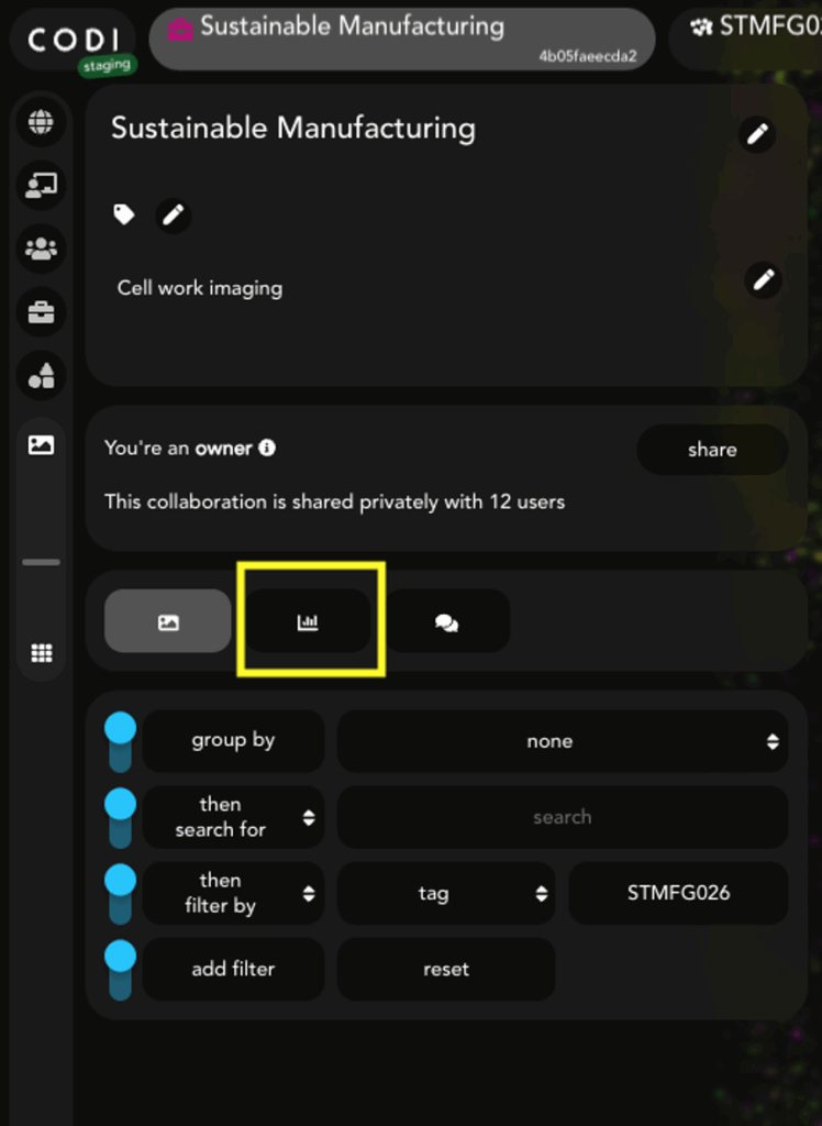
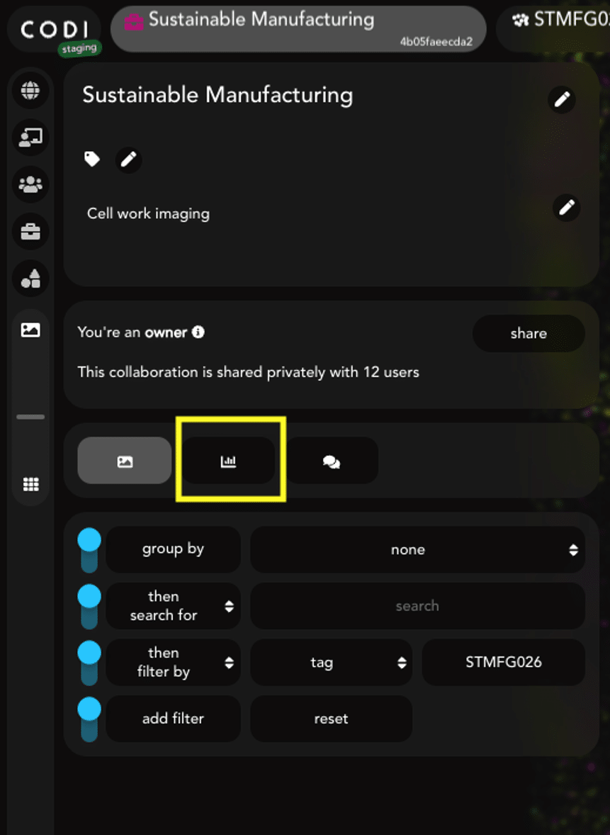
Figure 1: Within a CODI collaboration, click this button to view analysis results.

Figure 2: At the top of the analysis results section of CODI, the “batch download” button enables the checkboxes next to each analysis.
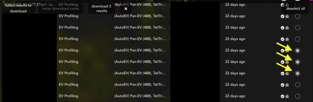
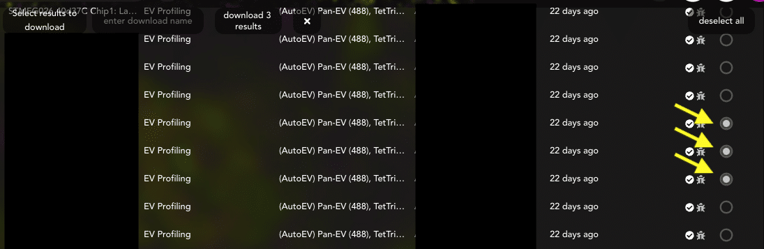
Figure 3: Select each analysis or FOV for the entire experiment.

Figure 4: Once all FOVs are selected, change the name in the yellow box to the chosen experiment title, then click the download button (pink box) to download the results. This might take a few minutes. It is important to keep this tab open until the download is complete.
Run the EVP2 Axis program to input data and pre-process results
Download the appropriate program zip file depending on the operating system in use (Mac or Windows). Unzip the folder and double-click on the application file (Figure 5). The EVP2 Axis program window should appear (Figure 6). If it does not happen automatically, check the “Troubleshooting” section (page 27).
Note
The file to run the EVP2 Axis program can be found under (Figure 5):
EVP2 Axis V2/EVP2 Axis V2.exe

Figure 5: Appearance of the file to run the program. The source code (python) can be found in the folder named “Source Code” in the build folder.
Once the main program window is open, click the blue “Browse” button on the main menu (Figure 6 and 7) and navigate to the folder containing the results batch file. Then press the “Choose” button (Figure 7, green arrow).

Figure 6: Browse through folders to find the results file.
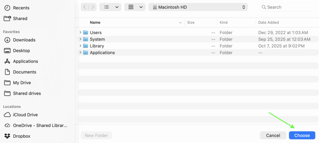
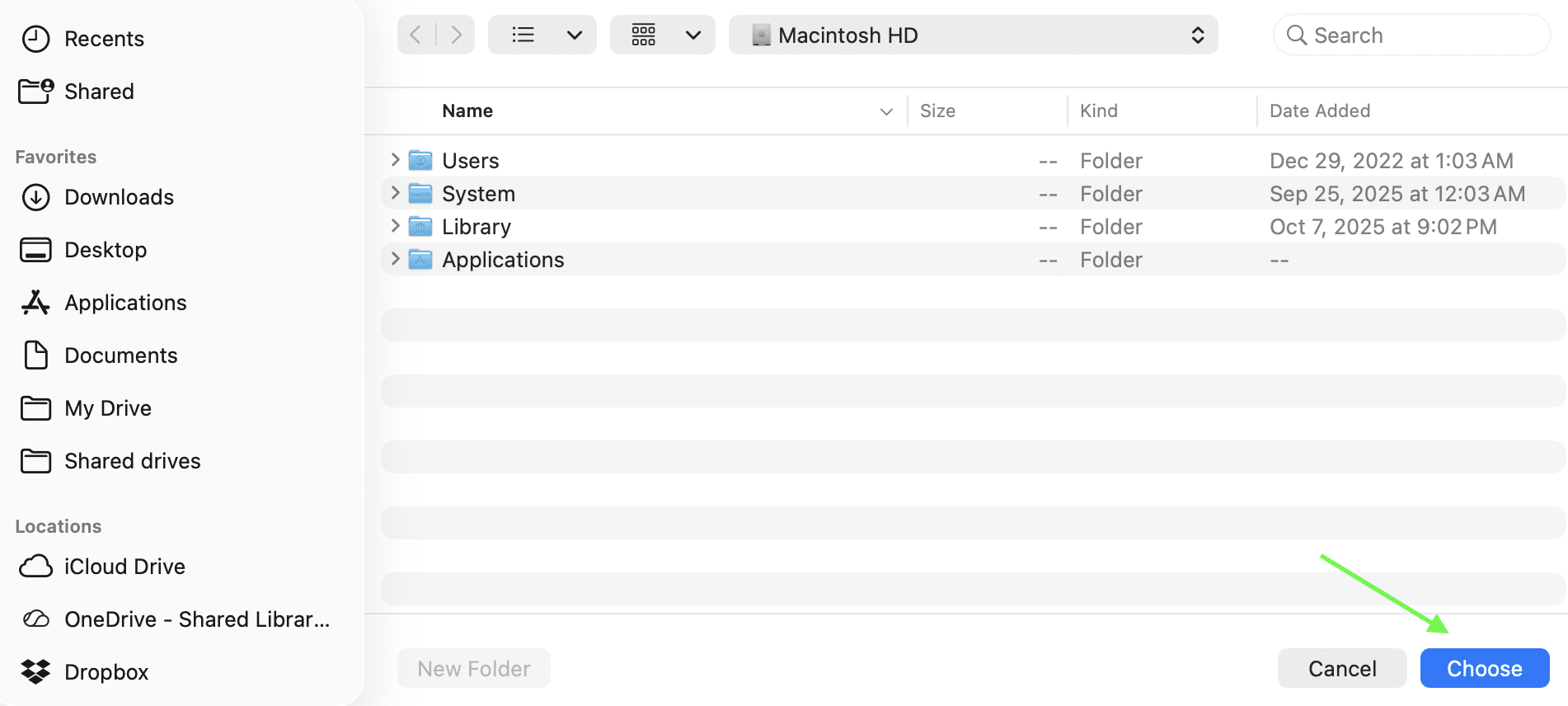
Figure 7: Select “Choose” once the desired results file has been found.
First, fill out the channel information for “Channel 0”, “Channel 1”, and “Channel 2” (Figure 8, yellow arrow). In case of doubt about the channel numbers, check the table below with the typical EV Profiler 2 kit configurations and the channel-marker correlation (Figure 8, pink arrow). For Pan-EV + Tetraspanin Trio (with no custom protein), leave the remaining channel blank. For Pan-EV + Tetraspanin Trio + Custom, replace “Custom” with the name of your marker of choice. Note: The channel names used at this stage will propagate to the plots and summary files.
Next, select the color mode for the generated plots in the dropdown menu (Figure 8, blue arrow). The default setting is “Black” for a black background with white text. If “White” is selected, plots will have a white background and black text.
There is also a checkbox below the color mode dropdown that is unchecked by default, labeled “Save .SVGs as well as .PNGs”. This checkbox can be selected to save the generated plots as vector format SVG files, as well as PNG image files. When ready, click the “Go” button (Figure 8, green arrow). At any time, click the red “Cancel” button or exit the app to cancel the run.
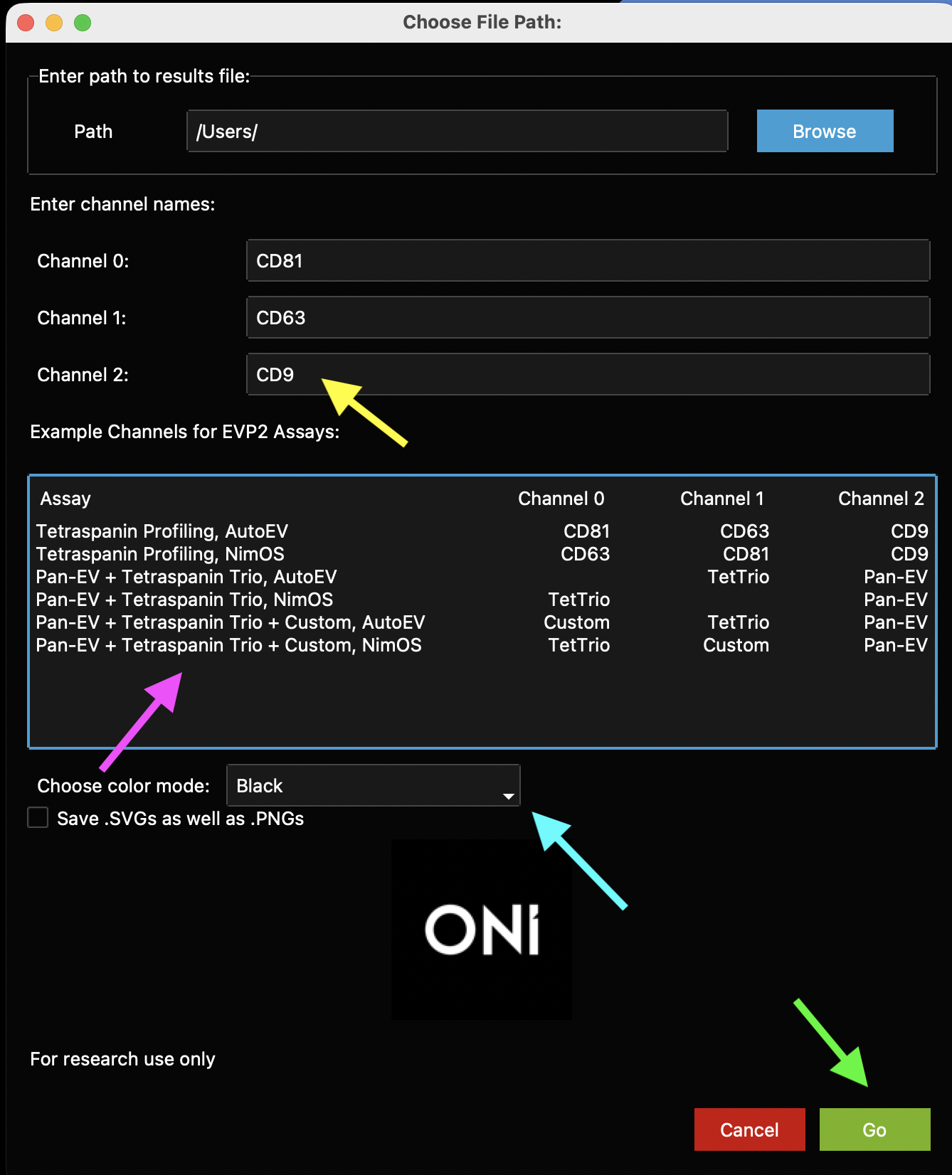
Figure 8: Main EVP2 Axis program window. First, enter the names of each channel (1, 2, or 3, depending on the experiment settings, yellow arrow). A guide to which channel names to type for which channel (depending on whether it was run using NimOS or AutoEV) is in a table labeled with a pink arrow. Change the color mode in the dropdown menu (blue arrow), then click Go when ready (green arrow).
The following window (“Experiment Details”) will appear, with a row shown for each lane found in the results file chosen. This section is fairly modifiable and user-defined (Figure 9, yellow arrows). The “Sample Name” will determine how the plots are generated: each Lane with the same Sample Name will be combined. Type in the relevant sample name under the Sample Name column for each row. All rows list the chip number (chip #) as 1 automatically. Replace the “1” with the corresponding Chip ID for each lane by typing a number on the Chip # column. This will be useful to color data by chip number.

Figure 9: The Sample Name column and Chip # column are initial placeholders. Input the chosen custom names and chip numbers and click Go to run. This is an example of what the sheet looks like with chip numbers filled out.
Note
If more than 4 lanes (i.e., more than one chip) are analyzed, the lane list is scrollable through a bar on the right-hand side. “Start” and “Stop” row buttons appear before and after the entries to help complete all entries (Figure 9, orange arrows).
If the titles listed under the “Lane” column are the appropriate ones, check the box “Keep Lane Names as Sample Names” to automatically copy the Lane names and leave the Sample Names column blank (Figure 9, blue arrow).
The checkbox entitled “Show Graphs?” (Figure 9, pink arrow) can be unchecked. Otherwise, auto-generated plots appear as pop-up windo The auto-generated plots show differences across samples (Figures 10-12) and are important for analyzing biotype distributions and marker positivity. Additional custom plots to visualize population-level differences can be generated with the Scatterplot, Violin Plot, or Histogram generator windows afterwards. All plots get saved in the same folder as the results file.
When ready, click the green “Go” button (Figure 9, green arrow).
Auto-Generated Plots
Cluster count swarm plot
The first pop-up plot generated is a dot plot (swarm plot, like those in GraphPad Prism) where the X axis is separated by the sample names provided at the Experiment Details window, and where dots are colored by chip. The Y axis shows the total number of EVs per FOV. This is generated for all experiments and can be resized using the keyboard keys “a” (zoom in) and “s” (zoom out)
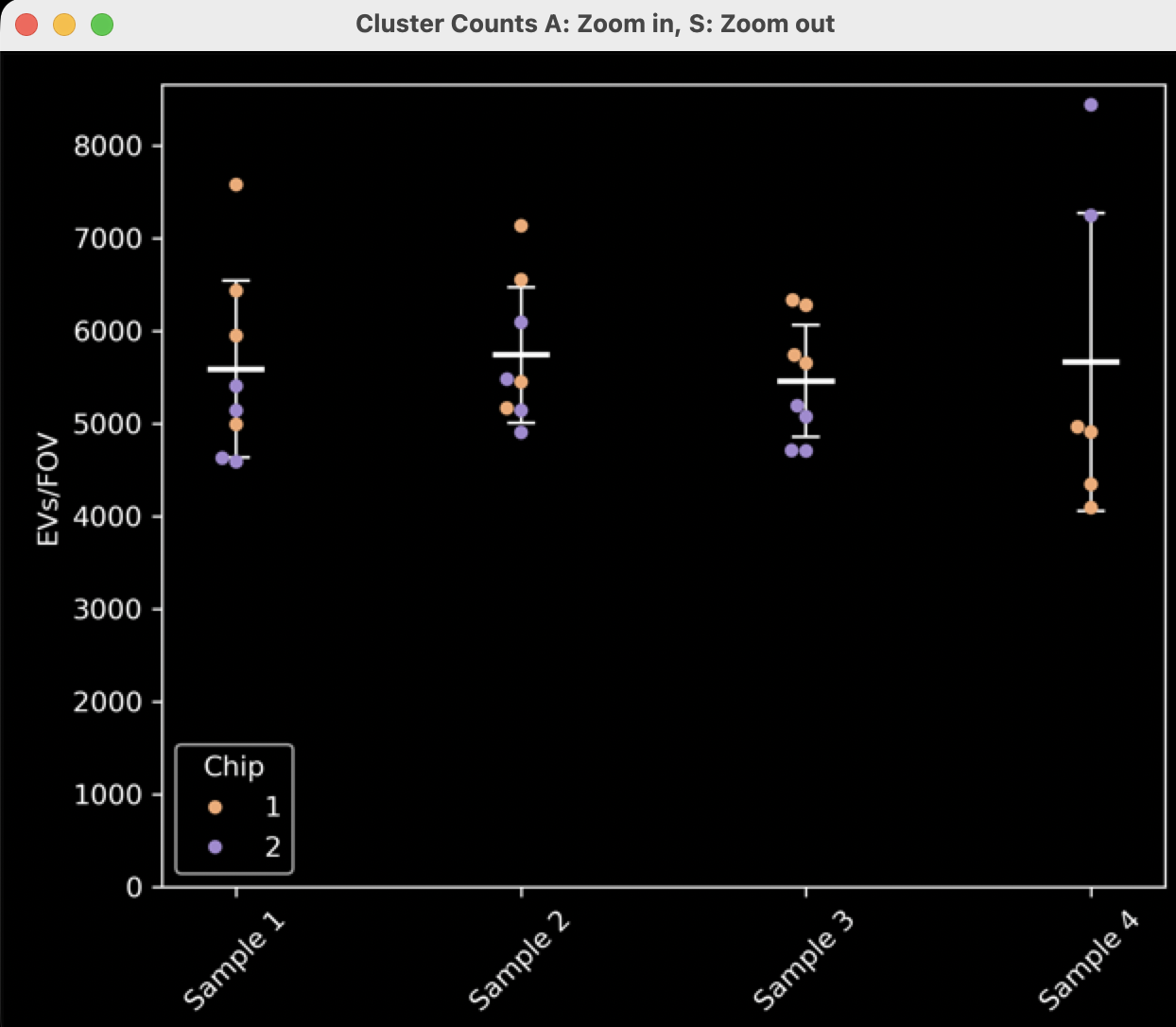
Figure 10: Cluster count swarm plot separated by sample name and colored by chip number.
Biomarker distribution plot
The second pop-up plot that is automatically generated is a stacked bar graph showing the proportion of the EV subpopulations containing each combination of markers (single-positive, double-positive, etc.) (Figure 11). If there is one channel, there will be one positivity group, and this plot might not be very useful. If there are two channels, there will be three positivity groups (2 single-positive and 1 double-positive). If there are three channels, there will be seven positivity groups (3 single-positive, 3 double-positive, and 1 triple-positive).
The displayed plot (“Normalized Biotype Distribution by Sample”) normalizes the data such that each FOV is normalized to 100%. The height of all the bars will be equal, representing 100% of the EVs in each FOV averaged for the sample. These plots are reminiscent of the plots that are generated in the CODI cross-dataset report/AutoEV output reports.

Figure 11: Biotype distribution histograms normalized to 100%.
- If the experiment contains one or more negative control lanes, where there are no EVs or no capture was used, the results might look quite skewed or strange for this lane. In this case, the Cluster Count Swarm Plot will be more informative.
- The non-normalized plot is also generated here and saved, but not shown, called a “Biotype Distribution by Sample”. This plot shows the total number of clusters (EVs) per Sample Name for each positivity type. This plot will contain data from all lanes and FOVs per sample. This plot will essentially be identical to the plot in Figure 12, but not normalized to 100%. Instead, the height of the bars will be different depending on the average number of FOVs, with error bars showing the standard deviation of the positivity in all FOVs.
Marker positivity plot
- The third and final pop-up plot generated contains bar charts showing marker positivity of EVs. This means the total number of EVs positive for each channel, regardless of positivity in other channels (Figure 12). Therefore, an EV that is double-positive will contribute to the positivity of both channels. There are N markers in this case, representing N channels.
- These plots will not be generated if the assay only has one channel, as each bar would be 100%.
- The displayed plot shows the normalized marker positivity per FOV. In the example plot (Figure 12), for each FOV in “Sample 1”, ~65% of the EVs are positive for CD81, ~50% of the EVs are positive for CD63, and ~70% of the EVs are positive for CD9. These numbers will add up to more than 100%. To better understand the values, read the “Understanding downloaded summary statistics” section.
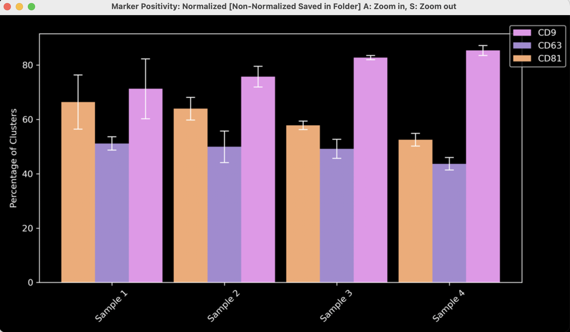
Figure 12: Marker positivity histograms normalized to 100%
- An additional plot generated here, but not shown, displays the average number of clusters positive for each channel per FOV. For example, these data would show that on average each FOV in ‘Sample A’ contains ~4000 EVs positive for CD81, ~3000 positive for CD63, and ~4000 positive for CD9. This does not mean there are 4000+4000+3000 EVs per FOV, since many EVs will be counted in 2 or more groups.
Custom plot: joint scatter plot with side histograms
- After the auto-generated plots pop up (unless the “Show Graphs?” is left unchecked), another window called “Scatter Plot Generator” opens (Figure 13). This window generates X number of plots for X number of Samples as identified by their “Sample Name”. Plots are customizable based on the menu items.
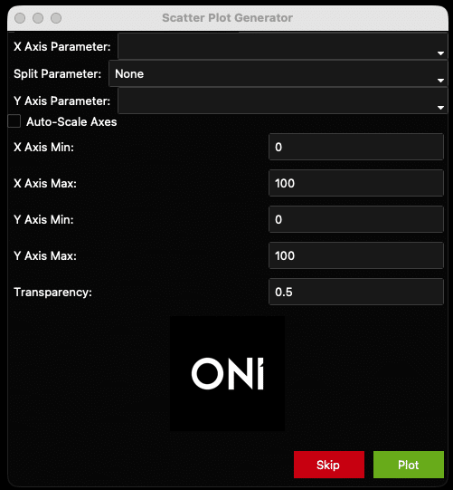
Figure 13: Scatter plot generator window.
- These plots are generated to show one point per EV and do not have means, standard deviations, etc. In this way, they are population-level analyses that show each EV as a separate data point, with one plot per sample. The auto-generated plots generated previously allow an across-sample comparison, and these Scatter plots allow for a population-level approach for each sample.
- “X Axis Parameter” is the parameter that will be plotted on the X axis. In the example plot (Figure 17), it is “Number of localizations” (i.e., number of locs per EV). All the X-Axis options can be found below (Figure 14).
- “Split Parameter” is the optional parameter that colors points based on a given parameter. For example, coloring each EV by chip # (Figure 17). Another example could be Biotype, in which EVs are colored based on their combinatorial positivity group (see explanation above: if one channel, only one group/color; if two channels, three groups/colors. if three channels, seven groups/colors). By default, the Split Parameter is “None. Keep “None” as the option to have all EVs be the same color. See all options below (Figure 14).
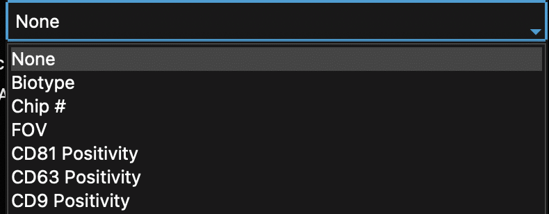
Figure 14: Scatter plot generator dropdowns with parameters that can split data by color.
- “Y Axis Parameter” is the parameter that will be plotted on the Y axis. These options are the same as the X axis (Figure 15).

Figure 15: Scatter plot generator dropdowns: All examples of parameters that can be plotted on the X axis and/or the Y axis.
- Check the “Auto-Scale” box to auto-scale the axes, or when unsure of how the data looks. Otherwise, set the axis minimums and maximums and plot transparency using the fields provided (see Figure 16 and the resulting Figure 17 as an example). Once ready, click the “Plot” button at the bottom of the window. The generated plot will pop up. Settings can be changed at any time by going back to the scatter plot window.
- All plots will be saved in the same folder as the results file. The window may be used as many times as wished for different plots.
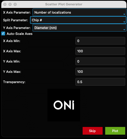
Figure 16: Example filled-out scatter plot window
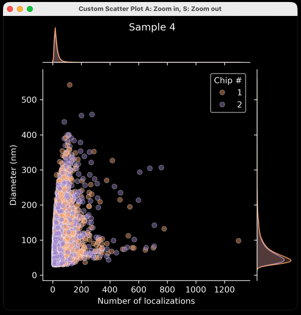
Figure 17: Example output from the settings in Figure 16.
Note
Click the “Skip” button to skip ahead to a different type of plot.
Custom Plot: Violin Plots
- After clicking “Skip” in the scatter plot generator window, a new window will appear entitled “Violin Plot Generator”, which can be used to generate a violin plot for a chosen parameter. The “Plotting Parameter” is the parameter that will be plotted along the X axis (e.g., diameter (nm), Figure 18). The options are the same as above (Figure 14).
- The plot will separate each sample by name and can be colored by choosing a “Split Parameter” (Figure 16). Alternatively, keep the “Split Parameter” set to None (Figure 18) which will color the violin plots by sample name (Figure 19).
- Data can be plotted on a log scale by checking the “Log Scale?” box below the “Split Parameter” dropdown menu.
- Once ready, click the “Plot” button at the bottom of the window. To skip ahead to a different plot type, click the “Skip” button. One of the generated plots will pop up. Go back to the violin plot window to change any of the settings.
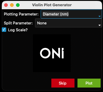
Figure 18: Violin plot generator filled out with the diameter parameter.
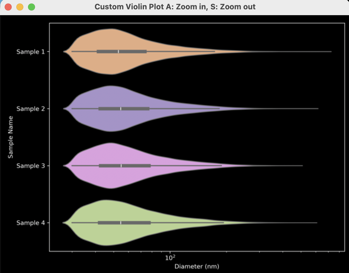
Figure 19: Example output from settings in Figure 18.
Custom Plot: Histograms
- After clicking “Skip” in the violin plot generator window, a new window entitled “Histogram Generator” appears. This window generates a histogram for the chosen parameter (Plotting Stat) separated by Sample Name and optionally colored by Split Parameter (Figure 20).
- “Plotting Parameter” is the parameter that will be plotted along the X axis (e.g., Counts in Channel 2 (CD9), Figure 20). The options are as above (Figure 14).
- There is the option to color based on a Split Parameter (e.g., chip #, Figure 23). The default setting is “None”.
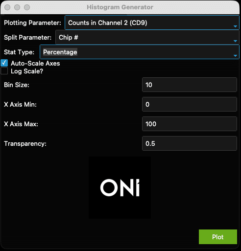
Figure 20: Example histogram generator window.
- There is also the option to plot histograms using Counts or Percentage (Stat Type, Figure 21).

Figure 21: Stat Type dropdown menu.
- Check the “Auto-Scale” box to auto-scale the axes, or when unsure of how the data looks. Otherwise, set the axis minimums and maximums and transparency (0 is transparent, 1 is opaque) using the fields provided. To plot these data on a log scale, check the “Log Scale?” box below the “Auto-Scale” checkbox.
- The “Bin Size” can be adjusted. This is not relevant for data plotted on log-scale axes. For example, ranges and suggested starting bin sizes (Table 2). Note that if a bin size that is too large for the data is chosen, e.g., a bin size of 5 for circularity, the histogram will not generate.
- Once ready, click the “Plot” button at the bottom of the window. All plots will be saved in the same folder as the results file. This window may be used as many times as wished for different plots.
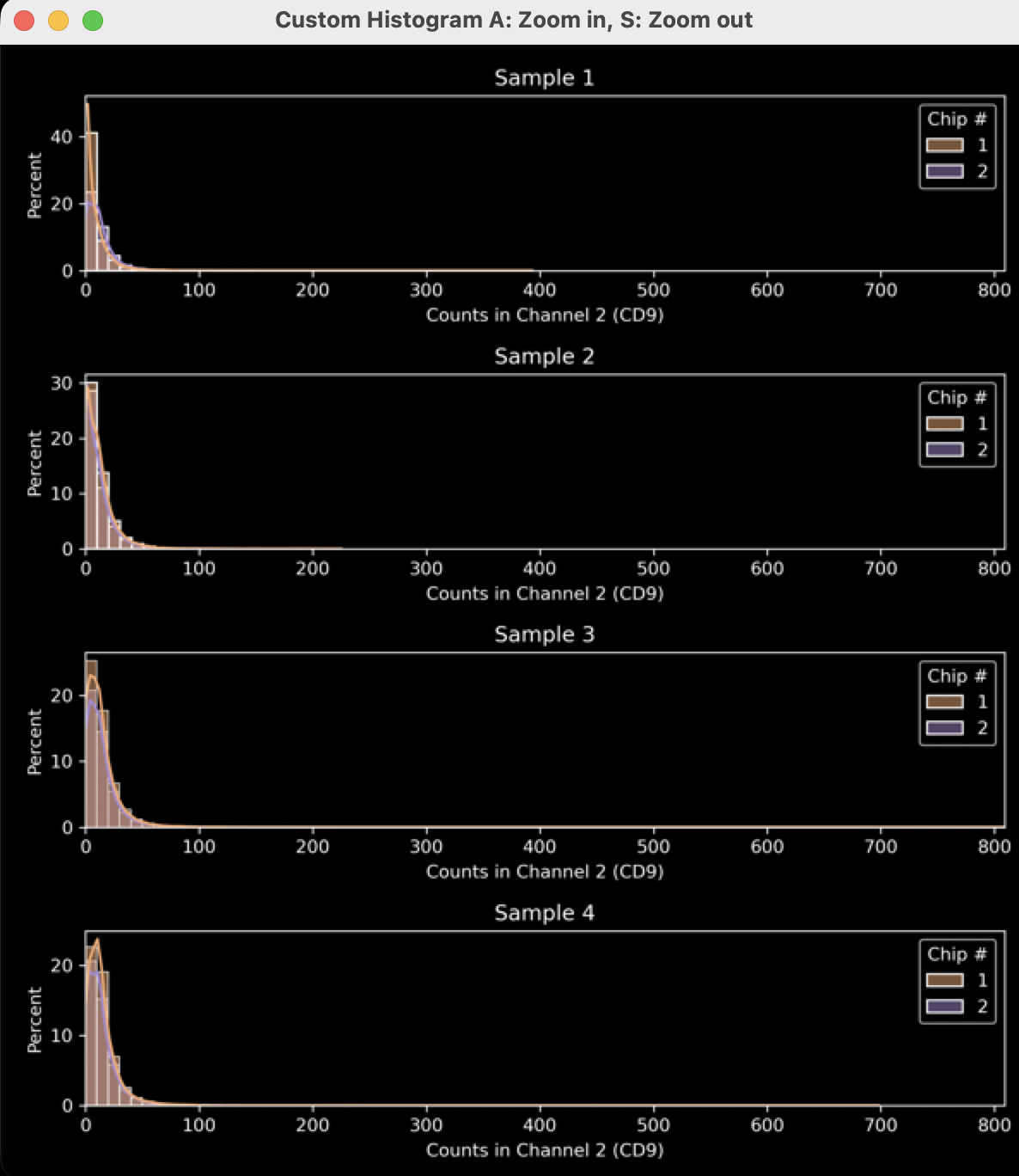
Figure 22: Example output from settings in Figure 20. See figures 23 and 24 for how different settings were used to improve the plot.
Table 2: Suggested starting ranges and bin sizes for histograms
| Plotting Statistic | Usual Range | Suggested Bin Size |
|---|---|---|
| Number of localizations | 0-4000 | 10-50 |
| Skew / Circularity | 0-4/0-1 | 0.01-0.05 |
| Density | 0-0.5 | 0.005-0.01 |
| Area / Discretized Area | 0-1000000 | 1000+ |
| Diameter / Length / Radius of Gyration | 0-1000 | 5-10 |
| Counts in Channel X | 0-2000 | 1-10 |
- In Figure 22, the data is mostly left-shifted and could be stretched to show the most important facets of the data. To fix this, uncheck the ”Auto-Scale Axes” checkbox (Figure 23, yellow arrow) and select more appropriate axis minimum and maximum values (Figure 23, pink arrow). The transparency is set to a higher value (Figure 23, green arrow) to improve visual clarity (Figure 24).
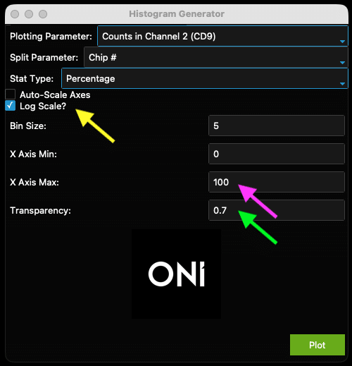
Figure 23: Example of adjusted histogram generator to improve output in Figure 24

Figure 24: Output from improved settings in Figure 23.
Understanding Downloaded Summary Stats
- A spreadsheet with several tabs (Figure 25) is in the same folder as all the plots.
- The first tab (“Mean by Sample and FOV”) shows the mean of each statistic from the results value as a “mean of means”, i.e. the mean of all FOV means for each statistic. For example, if two FOVs are taken and the mean diameters from each FOV are 120 nm and 130 nm, the mean for this sample will be 125, regardless of how many EVs there are in each FOV. The same logic applies to the second tab (“Standard Deviation by Sample and FOV”).
- The third tab (“Median by Sample”) combines every EV of each sample type and shows the median value for each statistic (not averaged in any way by FOV). The sixth tab (“Median by Sample and Positivity”) follows the same logic
- The fourth tab (“Mean by Sample and Positivity”) uses the same logic as tab 1, but separates EVs by Biomarker Distribution, meaning single-positive, double-positive, etc. The fifth tab (“Standard Deviation by Sample and Positivity”) also follows this logic.
Figure 25: Tabs in the “Summary Stats.xlsx” spreadsheet results file.
Installation troubleshooting
- Most companies have systems in place to prevent viruses from being downloaded and run on company computers. If these block the use of the EVP2 Axis program, there are some solutions to be applied.
- When using a Mac for instance, the following error message might appear (Figure 26). In this case, navigate to the privacy & security settings in the MacBook and navigate to Developer Tools. Then, click the “+” button and navigate to the .exe file and add it to the list (Figure 27). Then execute the EVP2 Axis program again.
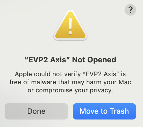
Figure 26: Error message upon initially opening EVP2 Axis on a MacBook with virus protection.
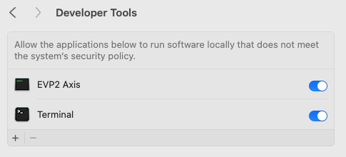
Figure 27: Adding the EVP2 Axis to Developer Tools allows the program to run.
A similar error message could appear again. If so, navigate back to the privacy & security settings and scroll down to the bottom, where it says “EVP2 Axis was blocked to protect your Mac.” Click “Open Anyway” next to it (Figure 28).
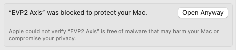
Figure 28: One further step may be required under Privacy & Security Settings.
- On a Windows computer, an error message might also appear. Click “More information”, then “Run Anyway” to allow the EVP2 Axis program to run.
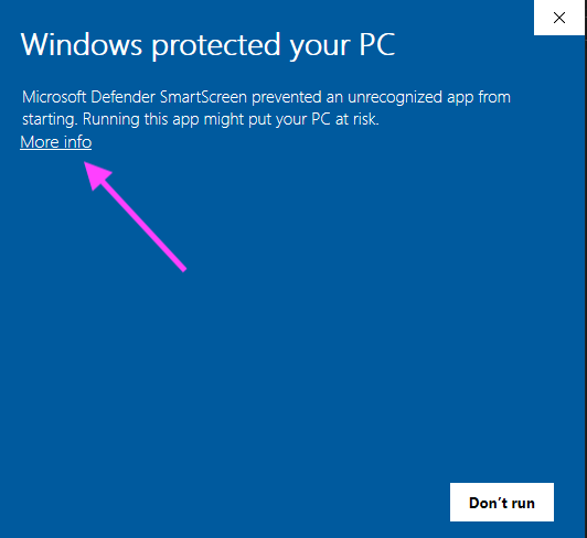
Figure 29: Example error message from a Windows machine. Click “More info”
Note
For ease of use, we recommend adding a shortcut to the .exe to the desktop. On a Mac, right click the .exe and click “Make Alias”, then copy to the desktop. On Windows, right-click the .exe and “Make Shortcut” to copy to the desktop.
For anything else, contact the ONI team through the Service Desk.
Print User Guide