Run CODI Locally With CODI Offline learn more
LNP Axis 3.0
Last updated: September 15th 2026

Free and open-source analysis tool for easy analysis for lipid nanoparticle (LNP) data across multiple datasets.
Instructions
Print Section
Overview
LNP Axis is a free and open-source analysis tool for easy analysis of lipid nanoparticle (LNP) data across multiple datasets. LNP Axis allows users to generate both standardized and custom plots with user-defined sample names, and the analysis of features such as LNP counts, cargo and ligand positivity, and abundance plots across several fields of view (FOVs) and samples.
LNP Axis is designed for use with datasets acquired using ONI’s AutoLNP software and analyzed using AI LNP Profiling analysis on ONI’s cloud-based analysis platform, CODI.
Download Results from CODI
To use LNP Axis, data must be downloaded from CODI using the batch download feature. To begin, select the collaboration of choice in CODI and click the “Analysis results” button on the left side (Figure 1). AI LNP Profiling analysis runs automatically with AutoLNP, resulting in a populated list of analyses in the results section.
Then, on the upper section click “batch download” (Figure 2):
1. Scroll to datasets of choice and click the empty circles to fill them in (Figure 3).
2. Change the name in the upper section (Figure 4, yellow box), then click “download X results” (2 here, Figure 4, pink box). A zip file will be downloaded automatically. It is important not to navigate away.
3. Open the zip file, which contains four files, and save them. The file needed for LNP Axis ends in “results_batch.csv”.


Figure 1: Within a CODI collaboration, click this button to view analysis results

Figure 2: At the top of the analysis results section of CODI, the “batch download” button enables the checkboxes next to each analysis.


Figure 3: Select each analysis or FOV for the entire experiment.

Figure 4: Once all FOVs are selected, change the name in the yellow box to the chosen experiment title, then click the download button (pink box) to download the results. This might take a few minutes. It is important to keep this tab open until the download is complete.
Run the LNP Axis program to input data input and pre-process results
Download the appropriate program zip file for the operating system in use (Mac or Windows). Unzip the folder and double-click the application file (Figure 5). The LNP Axis program window should appear (Figure 6). If it does not happen automatically, check the “Troubleshooting” section (page 27).
Note
The file to run the LNP Axis program can be found under (Figure 5): LNP Axis V2/LNP Axis V2.exe
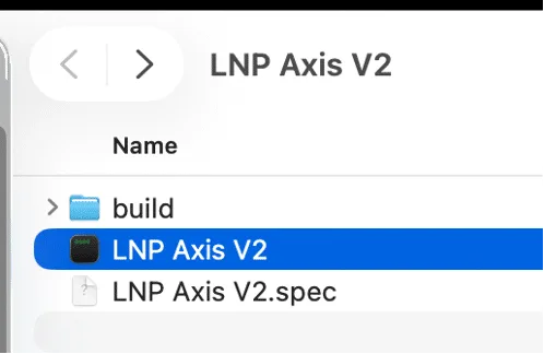
Figure 5: Appearance of the file to run the program. The source code (python) can be found in the folder named “Source Code” in the build folder.
Once the main program window is open, click the blue “Browse” button on the main menu (Figure 7) and navigate to the folder containing the results batch file. Then press the “Choose” button (Figure 6, pink arrow).

Figure 6: Browse through folders to find the results file and select “Choose” (pink arrow).
First, check or uncheck the Ligand and Cargo boxes as per the experimental setup (Figure 7, pink arrow). The channel names “Cargo” and “Ligand” can be changed by typing in the new names in the indicated boxes (Figure 7, blue arrow).
Next, select the color mode for the generated plots in the dropdown menu (Figure 8, green arrow). The default setting is “Black” for a black background with white text. If “White” is selected, plots will have a white background and black text.
There is also a checkbox below the color mode dropdown that is unchecked by default, labeled “Save .SVGs as well as .PNGs”. This checkbox can be selected to save the generated plots as vector format SVG files, as well as PNG image files. When ready, click the green “Go” button. At any time, click the red “Cancel” button or exit the app to cancel the run.

Figure 7: Main Window of the program. To browse through folders, click “Browse” (yellow arrow). Check/un-check Cargo and Ligand as per your experiment (pink arrow) and re-name if applicable (blue arrow). Change the color mode (“Black” or “White”) in the dropdown menu (green arrow)
The following window (“Experiment Details”) will appear, with a row shown for each lane found in the results file chosen. This section is modifiable and user-defined (Figure 8, yellow arrows):
- Each Lane has a checkbox next to it, which can be unchecked if any of the lanes are to be excluded from the analysis (brown arrow).
- The “Sample Name” will determine how the plots are generated: each Lane with the same Sample Name will be combined. Type in the relevant sample name under the Sample Name column for each row.
- All rows list the chip number (chip #) as 1 automatically. Replace the “1” with the corresponding Chip ID for each lane by typing a number in the Chip # column (yellow arrow). This will be useful to color and visualize data by chip number.
- All information will be saved as a CSV file in the folder where the results CSV is and will be used to populate the Sample Name and Chip information if LNP Axis is rerun on this same data. These values will remain changeable, however, in case Sample Name and Chip information need to be updated upon a rerun.

Figure 8: Example of Experiment Details window.
Note
If more than 4 lanes (i.e., more than one chip) are analyzed, the lane list is scrollable through a bar on the right-hand side. The “Start” and “Stop” row labels appear before and after the entries to help complete all entries (Figures 8-9, orange arrows).
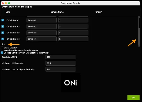
Figure 9. Example of completed experimental details. The Sample Name column and Chip # column are initial placeholders. Chosen custom names and chip numbers may be input before clicking Go to run the analysis.
If the titles listed under the “Lane” column are the appropriate ones, the box “Keep Lane Names as Sample Names” can be checked to automatically copy the Lane names and leave the Sample Names column blank (Figure 8, pink arrow). All plots will be saved automatically in the same folder as the results file.
Important: Unless the checkbox entitled “Show Graphs?” (Figure 8, pink arrow) is unchecked, auto-generated plots will appear as pop-up windows. The auto-generated plots show differences across samples (Figures 10-12) and are important for analyzing LNP formulation distributions and cargo/ligand positivity. Additional custom plots to visualize population-level differences can be generated afterwards. All plots get saved in the same folder as the results file.
Finally, if left unchecked, the third checkbox on this window is “Choose Sample Order: (Alphabetical otherwise)” will trigger for plots to contain samples from left to right or top to bottom alphabetically. If checked, a new window will appear after clicking the green “Go” button, enabling the manual selection of the sample order (Figure 10, see details below)
When ready, click the green “Go” button (Figure 8, green arrow).


Figure 10. Left: The Select Sample Order window, which appears if “Select Sample Order” was checked in the Experiment Details page (Figure 8, pink arrow). Right: The appearance of the Select Sample Order window if the order was reversed (4-1 instead of 1-4: Any order of digits may be selected here, if each digit is selected only once)
When you selecting the “Choose Sample Order” checkbox on the Experiment Details page, a new window will appear listing the user-defined sample names with numbers next to them (Figure 10), orange arrow. These numbers refer to the plotting order, starting at 1 and ending with the number of unique samples (4, in this case). The number of samples will be in the title (Figure 10, blue arrow). Any order of numbers may be chosen (Figure 10, right). When ready, click the green “Go” button (Figure 10, green arrow).
At this point, several plots then auto-generate with the samples in the chosen order, and the scatter plot page will be next to appear .
Optional: selecting color palettes
LNP Axis uses the same color palette as in previous versions by default, however, a choice of colors can be optionally be selected by the user with the latest version (LNP Axis V3).

Figure 11: Appearance of default lnp_palette.json file
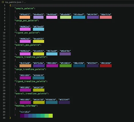
Figure 12. Default colors used in LNP Axis V3
To adjust the color palette, copy the “lnp_palette.json” file in the distribution folder for LNP Axis V3 (Figure 5) to the folder containing the results_batch.csv file downloaded from CODI. Open this file using any text editing software or VSCode (Figures 11-12). Replace any of the HEX codes with the HEX codes of the colors of your choosing: how they will plot is explained in detail below.
“Sample_palette” refers to the coloring in plots such as the Cluster Count swarm plot, Diameter histogram (without cargo positivity split), Cargo Positivity by Sample plot, Ligand Positivity by Sample plot, Cargo abundance by Sample plot, and the custom scatter plots, violin plots, or histograms. In the auto-generated swarm plots (see “Auto-generated plots” below), the points are colored by Chip (Chip 1 colored by the first color in “sample_palette”, Chip 2 colored by the second color, and so on). In the auto-generated Diameter Histogram, each sample will be colored in the order of “sample_palette” based on the order chosen by the user. After 8 samples (the length of the sample_palette), the palette restarts, however, there is no limit to how long this palette may be when selected by the user. For scatter plots, violin plots, and histograms, the colors in sample_palette are used when No Split is selected, or when splitting by Chip #, Lane, or FOV.
“Cargo_pos_palette” refers to the coloring in cargo-specific plots, such as the auto-generated cargo abundance vs. diameter scatter plot, or when splitting by cargo positivity in histograms, violin plots, or scatter plots. The same is true for the “ligand_pos_palette” for. These palettes will only use the first two entries: the first for negative LNPs, and the second for positive LNPs. “Overall_pos_palette” refers to coloring for overall positivity plots, such as the stacked histogram auto-generated plot (only relevant when both cargo and ligand are imaged in the LNP Profiler Kit assay) or when splitting by Overall Positivity on a scatter plot, violin plot, or histogram. In order from left to right, these values will color Single-Positive PanLNP, Double-Positive PanLNP + Ligand, Double-Positive PanLNP + Cargo, and Triple-Positive PanLNP + Ligand + Cargo.
The “trendline” palettes will only be used in the Scatter plot popup when a trendline is plotted. If a split is selected and a trendline is plotted at the same time, the color of the trendline will be a darker version of the color of the scatter points for that split. See “Custom plots: joint scatter plot with side histograms” for more details.
Last, the “heatmap_colormap” palette defaults to “viridis”, which will be used in the Scatter plot popup if “None-Heatmap” is selected as the split value. “Viridis” is a colormap defined in the Python package “matplotlib”, which is a colorblind-friendly, perceptually uniform sequential colormap. This can be changed to any colormap in matplotlib.Multiple examples are shown in Figure 13, and more can be found on the matplotlib website.
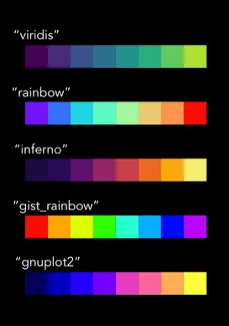
Figure 13. Example colormaps that can be used to generate heatmaps in the Scatter plot window. While these are shown as discrete square units, many of the colormaps in matplotlib are continuous. See the matplotlib website for colormap details.
Auto-Generated Plots
Cluster Count Swarm Plot
The first pop-up plot generated is a dot plot (swarm plot, like those in GraphPad Prism) where the X axis is separated by the sample names provided at the Experiment Details window, and where dots are colored by chip. The Y axis shows the total number of EVs per FOV. This is generated for all experiments and can be resized using the keyboard keys “a” (zoom in) and “s” (zoom out)

Figure 14: Cluster count swarm plot separated by sample name and colored by chip number.
Diameter Histogram (with or without Cargo Positivity split)
The second pop-up plot that is automatically generated is a histogram of LNP diameter distribution for each sample (Figure 15). If any cargo was labeled in the experiment, each sample will be split into cargo-positive (blue color) and cargo-negative (pink color) (Figure 16). This is generated for all experiment types.

Figure 15. Diameter Histogram example in an experiment without Cargo.
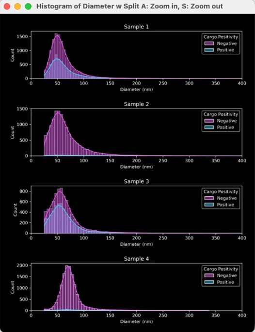
Figure 16. Diameter histogram example in an experiment with cargo labelling.
Scatter plot: marker abundance vs. diameter
The third auto-generated plot will depend on the type of experiment. If cargo is labelled and imaged, a plot will be generated for each sample. This will show each LNP as an individual data point on a cargo abundance (log) vs. diameter (nm) axis, colored by positivity (negative in pink or positive in cyan, Figure 17).
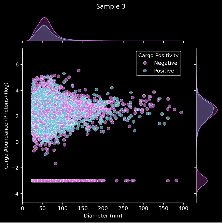
Figure 13: Scatter plot showing cargo abundance vs. diameter.
If any ligand is labeled and imaged, a plot will be generated for each sample and saved locally as a .png file. This shows each LNP on a ligand abundance vs. diameter (nm) axis, colored by positivity as well (Figure 18).

Figure 18: Scatter plot showing ligand abundance vs. diameter example
If both LNP cargo and ligand are imaged, both plots will be saved. The plot that appears will be for whichever is the last sample on the list. These plots will only be generated if cargo and/or ligand are selected in the initial window (Table 1).
Cargo Positivity Swarm Plot
The next autogenerated graph is a cargo positivity dot plot, where the X axis is separated by sample name, and the Y axis shows the percentage of cargo-positive LNPs in your sample. The dots are colored by chip. This plot will only be generated if LNP cargo is labeled and imaged. The error bars represent the mean +/- standard deviation of all FOVs.

Figure 19. Cargo positivity swarm plot.
Ligand positivity swarm plot
The following autogenerated graph is a ligand positivity dot plot, where the X axis is separated by sample name, and the Y axis shows the percentage of ligand-positive LNPs in your sample. The dots are colored by chip. This plot will only be generated if any LNP ligand is detected. The error bars represent the mean +/- standard deviation of all FOVs.

Figure 20: Ligand positivity swarm plot.
Cargo abundance swarm plot
The next auto-generated plot to pop up is a cargo abundance dot plot, where the X axis is separated by sample name, and the Y axis shows the abundance (~intensity, log) of cargo-positive LNPs. The dots are colored by chip. This plot will only be generated if any LNP cargo is labelled and imaged. The error bars represent the mean +/- standard deviation of all FOVs.

Figure 21: Cargo abundance swarm plot.
Stacked bars positivity plot
The last auto-generated plot is a stacked bar plot showing the percentage of LNPs positive for PanLNP only, PanLNP + Ligand, PanLNP + Cargo, or all PanLNP + Ligand + Cargo. This plot is only generated when both Cargo and Ligand are imaged. The error bars represent the mean +/- standard deviation of all FOVs.
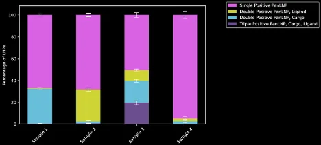
Figure 22. Stacked bar plot.
Table 1: Summary of auto-generated plot statistics obtained based on the sample and markers.
| Plotting Statistic | PanLNP only | PanLNP + cargo | PanLNP + ligand | PanLNP + cargo+ligand |
|---|---|---|---|---|
| Cluster counts by sample | ✓ | ✓ | ✓ | ✓ |
| Diameter histogram | ✓ | ✓ | ✓ | ✓ |
| Cargo abundance (log) vs. Diameter | ✓ | ✓ | ||
| Ligand abundance vs. diameter | ✓ | ✓ | ||
| Cargo positivity by FOV | ✓ | ✓ | ||
| Ligand positivity by FOV | ✓ | ✓ | ||
| Cargo abundance (log) by FOV | ✓ | ✓ | ||
| Stacked histogram | ✓ |
Custom plots: joint scatterplot with side histograms
After the auto-generated plots pop up (unless the “Show Graphs?” is left unchecked), another window called “Scatter Plot Generator” opens (Figure 23). This window generates X number of plots for X number of Samples as identified by their “Sample Name”. Plots are customizable based on the menu items.
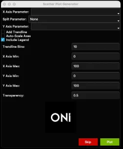
Figure 18: Scatter plot generator window.
- These plots are generated to show one point per LNP and do not have means, standard deviations, etc. In this way, they are population-level analyses that show each LNP as a separate data point, with one plot per sample. The auto-generated plots generated previously allow an across-sample comparison, and these Scatter plots allow for a population-level approach for each sample.
- “X Axis Parameter” is the parameter that will be plotted on the X axis. In the example plot (Figure 25), it is “Number of localizations” (i.e., number of locs per LNP). All the X-axis options can be found below (Table 2).
- “Split Parameter” is the optional parameter that colors points based on a given parameter. For example, coloring each LNP by chip # (Figure 25). Another example could be Overall Positivity, in which LNPs will be colored based on their combinatorial positivity group. E.g., if both ligand and cargo are checked, there will be four groups: PanLNP only, PanLNP + Cargo, PanLNP + Ligand, and PanLNP + Cargo + Ligand. By default, the Split Parameter is “None”. Keep “None” as the option to have all LNPs be the same color. See all options below (Table 3).
- Users may instead wish to color the scatter plots based on relative density: to do so, select “None – Heatmap” in the Split Parameter dropdown (See Figure 26 for an example). In this case, a kernel density estimation will be used to estimate the probability density function of the X and Y axis data being plotted over the range of the values in the results file. The results are normalized, and add up to 1. The legend will show the individual probability density of each individual point.
- “Y Axis Parameter” is the parameter that will be plotted on the Y axis. These options are the same as the X Axis (Table 2).
- Check the “Trendline” box to add an optional “trendline” to the scatter plot. These plots are helpful with dense datasets to show any trends or relationships between the two variables chosen on a scatter plot, and if there are differences in this relationship in different groups (or “splits”). This “trendline” is a binned plot based on the number of bins provided in the “Trendline bins” section. The data is binned in the X axis and the mean and standard error of the mean (SEM) of the Y axis are plotted on top of the scatter plot (See Figure 27 for an example).
- Check the “Auto-Scale” box to auto-scale the axes, or when unsure of how the data looks. Otherwise, set the axis minimums and maximums and plot transparency using the fields provided.
- Check the “Include Legend” box to include a legend. Occasionally, legends can hide data points. Especiallyfor dense samples, it can be helpful to plot once with a legend and once without to ensure data is not behind a legend. Both plots will saved independently, one with “legend” in the filename and one without.
- Once ready, click the “Plot” button at the bottom of the window. The generated plot will pop up. Settings can be changed at any time by going back to the scatter plot window.
- All plots will be saved in the same folder as the results file. The window may be used as many times as wished for different plots.
Note
Click the “Skip” button to skip ahead to a different type of plot.
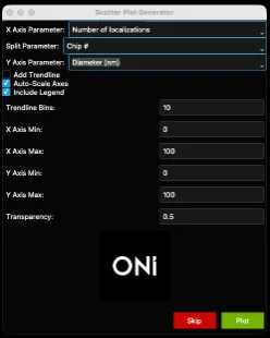
Figure 24. Example filled-out scatter plot window.

Figure 25. Scatter plot generated from Figure 24.
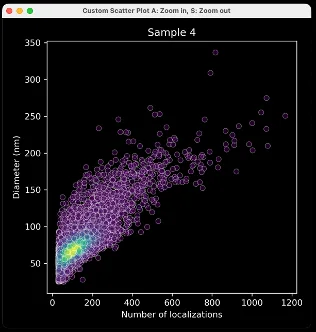
Figure 26. Heat Map generated from Figure 24 with “Split Parameter” adjusted to “None – Heatmap” and “Include Legend” unchecked
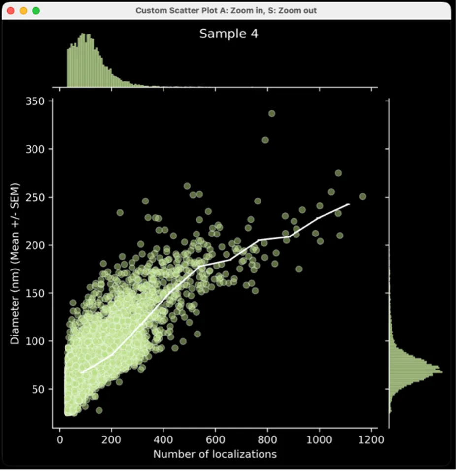
Figure 27. Scatter plot generated from Figure 24 with “Split Parameter” adjusted to “None” and “Add Trendline” Checked
Table 2: Axis parameters for scatter plot, violin plot, and histogram generators.
| Plotting Parameter | PanLNP only | PanLNP + cargo | PanLNP + ligand | PanLNP + cargo+ligand |
|---|---|---|---|---|
| Shape Descriptors (Skew, Circularity, Area, Discretized Area, Diameter, Length, Radius of Gyration) | ✓ | ✓ | ✓ | ✓ |
| Number of Localizations | ✓ | ✓ | ✓ | ✓ |
| PanLNP Abundance (Counts) | ✓ | ✓ | ✓ | ✓ |
| Cargo Abundance (DL, photons) | ✓ | ✓ | ||
| Cargo Abundance – log transformed | ✓ | ✓ | ||
| Ligand Abundance (Counts) | ✓ | ✓ |
Table 3: Split parameter options for scatter plot, violin plot, and histogram generators.
| Plotting Parameter | PanLNP only | PanLNP + cargo | PanLNP + ligand | PanLNP + cargo+ligand |
|---|---|---|---|---|
| None | ✓ | ✓ | ✓ | ✓ |
| Chip # | ✓ | ✓ | ✓ | ✓ |
| Lane | ✓ | ✓ | ✓ | ✓ |
| FOV | ✓ | ✓ | ✓ | ✓ |
| Cargo Positivity | ✓ | ✓ | ||
| Ligand Positivity | ✓ | ✓ | ||
| Overall Positivity | ✓ |
Custom Plot: Violin Plots
- After clicking “Skip” in the scatter plot generator window, a new window will appear entitled “Violin Plot Generator”, which can be used to generate a violin plot for a chosen parameter. The “Plotting Parameter” is the parameter that will be plotted along the X axis (e.g., diameter (nm), Figure 21). The options are the same as above (Table 2).
- The plot will separate each sample by name and can be colored by choosing a “Split Parameter” (Table 3). Alternatively, keep the “Split Parameter” set to None (Figure 21), which will color the violin plots by sample name (Figure 22).
- Data can be plotted on a log scale by checking the “Log Scale?” box below the “Split Parameter” dropdown menu.
- Check the “Include Legend” box to include a legend. Occasionally, legends can hide data points. Especially for dense samples, it can be helpful to plot once with a legend and once without to ensure data is not behind a legend. Both plots will saved independently, one with “legend” in the filename and one without.
- Once ready, click the “Plot” button at the bottom of the window. To skip ahead to a different plot type, click the “Skip” button. One of the generated plots will pop up. Go back to the violin plot window to change any of the settings.
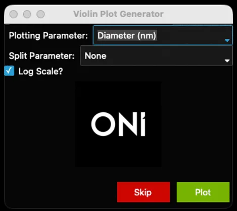
Figure 28: Example-filled violin plot window.
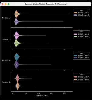
Figure 22: Result from settings in Figure 21.
Custom Plot: Histograms
- After clicking “Skip” in the violin plot generator window, a new window entitled “Histogram Generator” appears. This window generates a histogram for the chosen parameter (Plotting Stat) separated by Sample Name and optionally colored by Split Parameter (Figure 23).
- “Plotting Parameter” is the parameter that will be plotted along the X axis (e.g., Circularity, Figure 23). The options are as above (Table 2).
- There is the option to plot histograms using counts or percentages (stat type, Figure 23), of coloring the plot based on a Split Parameter (e.g., chip #, Figure 26). The default setting is “None”.

Figure 30: Histogram Generator Window
- Check the the “Auto-Scale” box to auto-scale the axes, or when unsure of how the data looks. Otherwise, set the axis minimums and maximums and transparency (0 is transparent, 1 is opaque) using the fields provided. To plot these data on a log scale, check the “Log Scale?” box below the “Auto-Scale” checkbox. To plot a legend on the histogram, keep the “Legend” box checked. Otherwise, uncheck the “Legend” box to remove the legend.
- The “Bin Size” can be adjusted. This is not relevant for data plotted on log-scale axes. For example, ranges and suggested starting bin sizes (Table 4). Note that if a bin size that is too large for the data is chosen, e.g., a bin size of 5 for circularity, the histogram will not generate.
- Once ready, click the “Plot” button at the bottom of the window. All plots will be saved in the same folder as the results file. This window may be used as many times as wished for different plots.
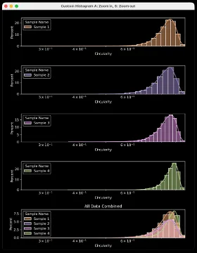
Figure 31. Example output from settings in Figure 30. See figures 32 and 33 for a different example of settings and resulting plots.
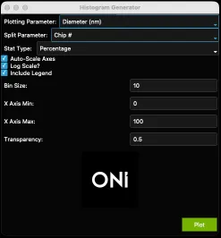
Figure 32: Another example filled-out histogram window.

Figure 33: Output from settings in Figure 25.
Table 4: Suggested starting ranges and bin sizes for histograms
| Plotting Parameter | Usual Range | Suggested Bin Size |
|---|---|---|
| Number of localizations | 0-4000 | 10-50 |
| Skew / Circularity | 1-3 / 0-1 | 0.01-0.05 |
| Density | 0-0.5 | 0.005-0.01 |
| Area / Discretized Area | 0-1000000 | 1000+ |
| Diameter / Length / Radius of Gyration | 0-1000 | 5-10 |
| Counts in Channel X | 0-2000 | 1-10 |
| Cargo abundance (log) | 0-5 | 0.1-0.5 |
Installation troubleshooting
Summary data statistics
Print Section
A spreadsheet with several tabs (Figure 34) containing a summary of the analysis, such as mean values, standard deviations, and medians, is included in the same folder as all the plots. This spreadsheet can be useful for reporting metrics in publications and seeing data separated by FOV, Lane, Chip, Sample, Positivity, and more.


Figure 34: Summary statistics (stats) spreadsheet titles.
Tab 1: Key Stats
Each of the different key statistics provided for each Sample Name measured in Tab 1 (Figure 35) represents the mean of all FOVs included in the lanes labeled with the specific sample name. First, the mean particle diameter (nm) is shown, then separated by cargo-positive and cargo-negative particles.
Next, the number of ligand localizations in ligand-positive particles is shown. For information on all particles and ligand-negative particles, navigate to the Ligand Stats tab. Next, the cargo-only and ligand-only positivity is calculated. These are particles that contain PanLNP and Cargo only, or PanLNP and Ligand only. Cargo + Ligand positivity refers to Triple Positive PanLNP + Cargo + Ligand LNPs. These three columns include no particles in common, but likely will not add up to 100% (the remainder of particles are the PanLNP-only, single-positive particles).
The next columns, “Total Cargo Positivity (%)” and “Total Ligand Positivity (%)” show the total positivity of each marker regardless of positivity in the other channel. Thus, these columns might add up to more than 100%. Last, the average number of clusters per FOVs is shown, and the total number of clusters in all FOVs in lanes labeled with the sample name on each row.


Figure 35: Key Stats tab titles
Tab 2: Axis Parameters
The second tab of the summary statistics spreadtab shows the information imported into LNP Axis and the optional custom cutoffs. If the user inputs custom names for the PanLNP, Ligand, and Cargo markers, they will be shown in column D. The optional cutoffs (minimum diameter for clusters using the PanLNP channel and minimum number of localizations in the ligand channel for an LNP to be considered “Positive”) are shown in Column E. If the user did not input any cutoffs, the cutoffs shown will be the cutoffs run in the CODI analysis. The default settings for these cutoffs in CODI are 25.0 nm minimum diameter and 3.0 minimum localizations for ligand positivity.

Figure 36: Example Axis Parameters tab
Tab 3: Sample Parameters
The third tab of the summary statistics spreadsheet is a printout of the Experiment Details window of LNP Axis, in which the sample names and chip numbers are input.
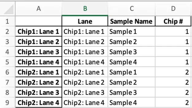
Figure 37. Example Sample Parameters tab
Tab 4: Cluster Stats
The fourth tab of the summary statistics tab summarizes cluster shape statistics and LNP count statistics for each unique Sample Name. The sum of LNPs in all FOVs associated with each sample name is in column B, and columns C-E show the mean, standard deviation, and median of the number of LNPs per FOV. Columns F-H show the number of unique Lanes, FOVs, and Chips associated with the Sample Name, respectively. All statistics on this tab are performed on a per-FOV (per-dataset) basis. For example, the mean skew of a sample named “Sample A” containing 16 FOVs from 4 lanes would represent the mean of 16 values: each value being the mean of the skew of all LNPs in each FOV. This contrasts with calculating the mean on a per-LNP basis, where all LNPs, regardless of FOV/dataset, are listed, and the mean is taken of that list. The remaining columns show the mean, standard deviation, and median of various shape statistics that are measured in CODI. For more information on these metrics, visit the CODI Help Desk.


Figure 38: Cluster Stats tab headers
Tab 5: Cargo Stats
If the Cargo checkbox is selected on the first window of LNP Axis, a Cargo-specific tab will be generated. If a custom name was selected, “Cargo” will be replaced with the custom name in this tab. This tab calculates cargo statistics for each Sample Name (one row per sample). The total number of LNPs in each sample, the total number of cargo-positive LNPs, and the average percentage of cargo-positive LNPs in all FOVs is calculated. The mean, standard deviation, and median cargo abundance in photons is also measured, separated first by Cargo-Positive and Cargo-Negative LNPs, then calculated for all LNPs regardless of cargo positivity.

Figure 39. Cargo Stats tab headers
Tab 6: Ligand Stats
If the Ligand checkbox is selected in the first window of LNP Axis, a Ligand-specific tab will be generated. If a custom name was selected, “Ligand” will be replaced with the custom name in this tab. This tab calculates ligand statistics for each Sample Name (one row per sample). The total number of LNPs in each sample, the total number of ligand-positive LNPs, and the average percentage of ligand-positive LNPs in all FOVs are calculated. The mean, standard deviation, and median ligand abundance in localizations are also measured, separated first by Ligand-Positive and Ligand-Negative LNPs, then calculated for all LNPs regardless of ligand positivity.

Figure 40: Ligand Stats tab headers
Tab 7: Cluster Stats by Positivity
This tab shows the same data as Tab 4 (Cluster Stats) but separated by LNP positivity. In an experiment containing both Cargo and Ligand imaging, there will be four positivity groups: Single-Positive PanLNP, Double-Positive PanLNP + Cargo, Double-Positive PanLNP + Ligand, and Triple-Positive PanLNP + Cargo + Ligand. The number of LNPs, FOVs, Lanes, and Chips is calculated for each positivity group in each sample, and shape statistics are calculated for each positivity group in each sample.

Figure 41: Cluster Stats by Positivity row titles. Tab headers are the same as in Figure 38
Tab 8: Dataset Means
The last tab in the summary statistics tab calculates the mean of various statistics for each FOV in the results file. First, the shape statistics are averaged (Diameter, Number of localizations, etc.) for each FOV. The dataset name (as provided by the user) and the dataset ID (the unique ID/URL seen in CODI) is also printed on the tab. The total number of LNPs here is the total number found by the clustering tool, however, if Cargo is imaged some of these LNPs are discarded due to overlap. The shape values include all LNPs, and the majority of these LNPs (but not all) are then graded for Ligand and Cargo Positivity. Columns N, O, P, and Q calculate the total number of positive LNPs for each marker and the positivity percentage in the selected FOV.
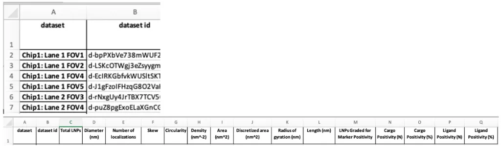
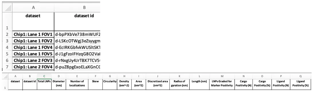
Figure 42. Dataset Means row titles and tab headers
Installation troubleshooting
Print Section
- Most companies have systems in place to prevent viruses from being downloaded and run on company computers. If these block the use of the LNP Axis program, there are some solutions to be applied.
- When using a Mac for instance, the following error message might appear (Figure 43). In this case, navigate to the privacy & security settings in the MacBook and navigate to Developer Tools. Then, click the “+” button and navigate to the .exe file and add it to the list (Figure 44). Then execute the LNP Axis program again.
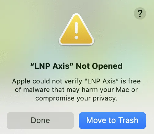
Figure 43: Error message upon initially opening a GUI on a MacBook with virus protection

Figure 44: Adding the LNP Axis exe to Developer
A similar error message could appear again. If so, navigate back to the privacy & security settings and scroll down to the bottom, where it says “LNP Axis was blocked to protect your Mac.” Click “Open Anyway” next to it (Figure 45).
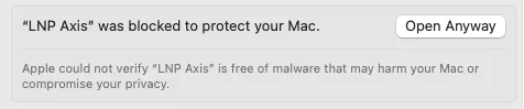
Figure 45: One further step may be required under Privacy & Security Settings.
On a Windows computer, an error message might also appear. Click “More information”, then “Run Anyway” to allow the LNP Axis program to run.

Figure 46: Example error message from a Windows machine. Click “More info”

Figure 47: After clicking “More info”, click “Run Anyway”
Note
For ease of use, we recommend adding a shortcut to the .exe to the desktop.
On a Mac, right click the .exe and click “Make Alias”, then copy to the desktop.
On Windows, right-click the .exe and “Make Shortcut” to copy to the desktop.
For anything else, contact the ONI team through the Service Desk.
Print User Guide